FlowerAura
Floweraura.com
E-Commerce Re-Design
Floweraura.com is an online flower & cakes store that delivers flowers, cakes and many other great gifts all over India.
If you need to give someone an unforgettable gift, this is the right place to go. Powered by a strong affiliate
network and channel stores, Floweraura is ready to offer its gifts in more than 180 cities across India.

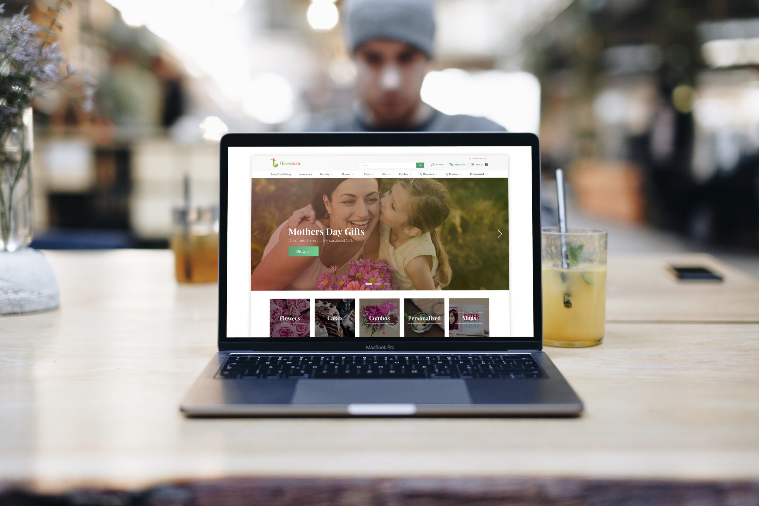
These are new designs for FlowerAura

My Role
As a design consultant with Floweraura, I was responsible for coming up with a redesign strategy. The purpose of this strategy was to better convey the brand value and more effectively educate the users on how to use its products. This is why a very bold rebranding was needed.
Problem Statement
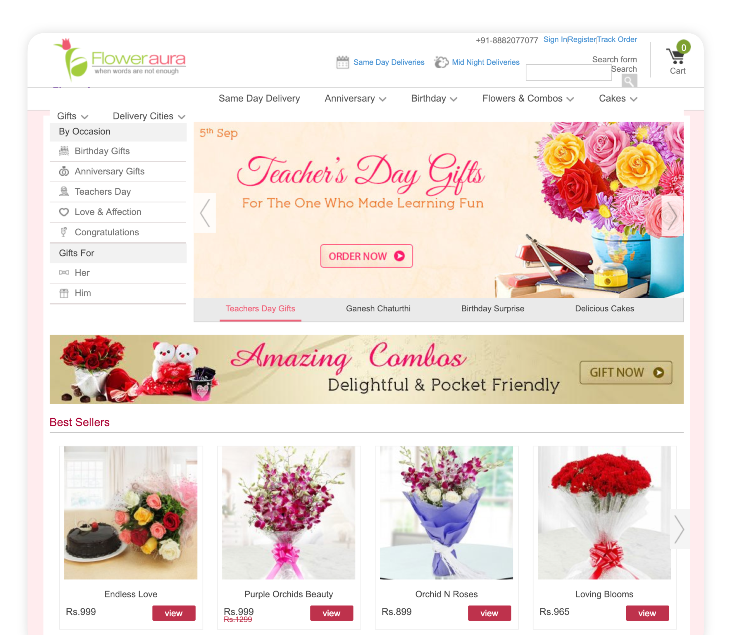
Floweraura is not like any other project and it required my full experience and attention. This is because it is not a random website selling products, it is selling an experience, a moment of happiness. Thus, redesigning it meant filling the gap between what Floweraura wanted to communicate to the users and the buying experience.
Designing consumer products is always challenging, especially when you are designing a product which is selling an emotional experience to users.

Solution
But enhancing a design to fit the needs of the customers in this field does not necessary mean overwhelming them with color. In order not to confuse the user with multiple patterns, redefining the UX strategy was also a part of solution. My goal for this project focused on delivering an intuitive UX, taking into consideration the brand experience in a digital space.
Building Floweraura’s design strategy was also challenging because I had to make sure that each and every customer got to his gift easily, something I managed through design. Therefore, I provided different clues such as Gifts for Him, Gifts for Her, Browse by Occasion, Browse by Relation etc.
Because they are striking and communicative, imagines play an important part in designing and this is why I made sure mine were bold, daring, but most importantly, told a story to the user.
When we speak of a website rebranding, colors are as important as the chosen images. I chose flat and soothing ones because they throw less strain on users’ eyes and resorted to tints of green, red or pink, the brand colors.

Research, Data and Brainstorming
Research was conducted at the beginning of the project to understand the targeted customer’s needs and frustrations, and to figure out how Floweraura would stack-up and be differentiated in the market.
Before starting the actual design of the website, I studied lots of complex data points, heat maps, and defined the clear objectives of the project. Apart from studying mere data, we created a detailed questionnaire in order to understand the pain points of the users and spoke to 40 people.


First Impression
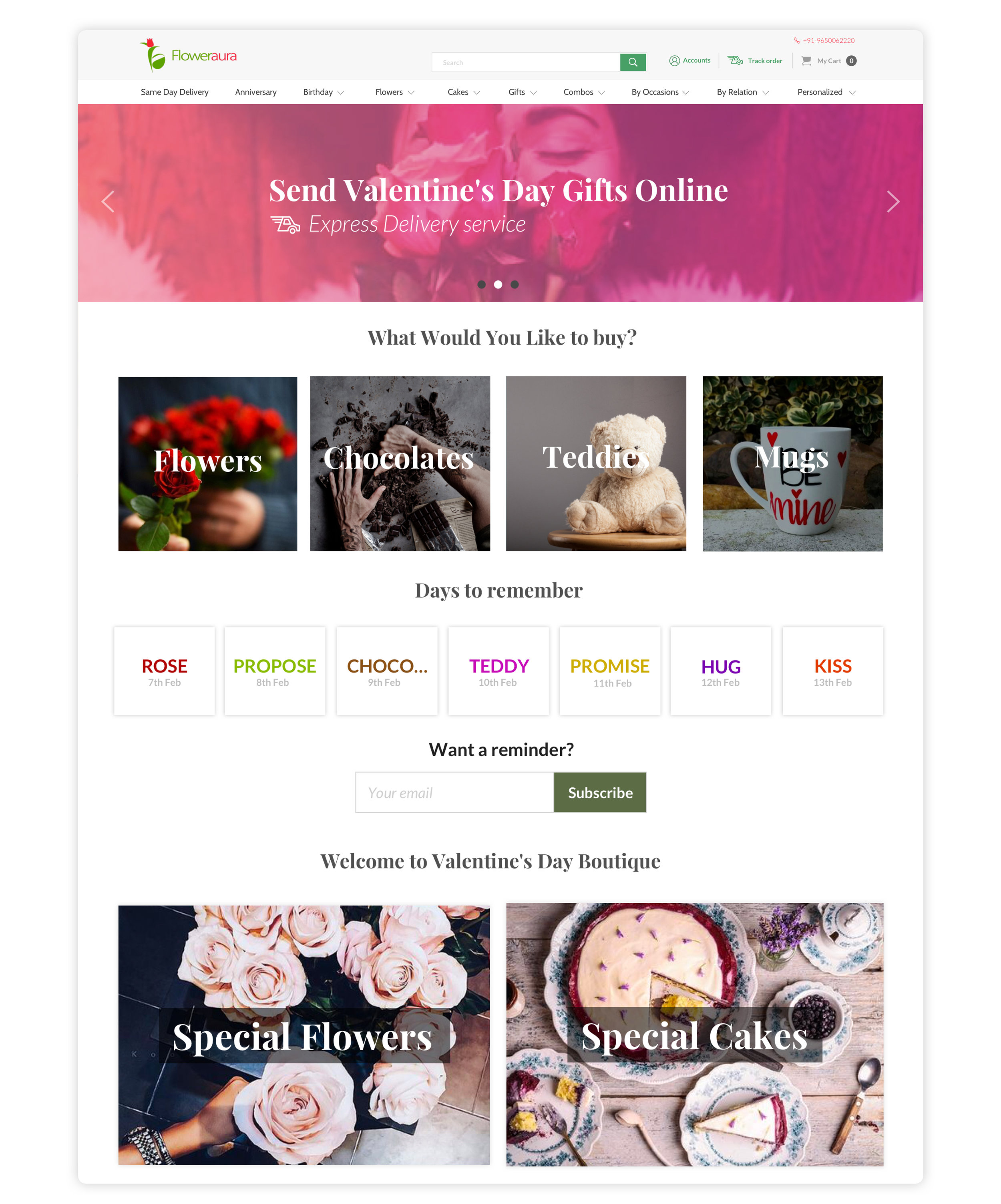
They say that a picture is worth a thousand words. That must be true when speaking about a brand dedicated to offering gifts like Floweraura. This is why we have chosen images instead of icons to speak the truth of our brand.
Because listings give the impression of a formal expression, we chose banners instead. Big, expressive banners, which are meant to confirm to the user that here he can find the emotion he is looking for. And find it fast, as well.
1Size Doesn’t fit all
Landing pages – Instead of creating a standard template for the most prominent and popular occasions, we created unique landing pages. This helps emphasize the emotion of the occasion, being therefore easier to promote the products.

We know what users want
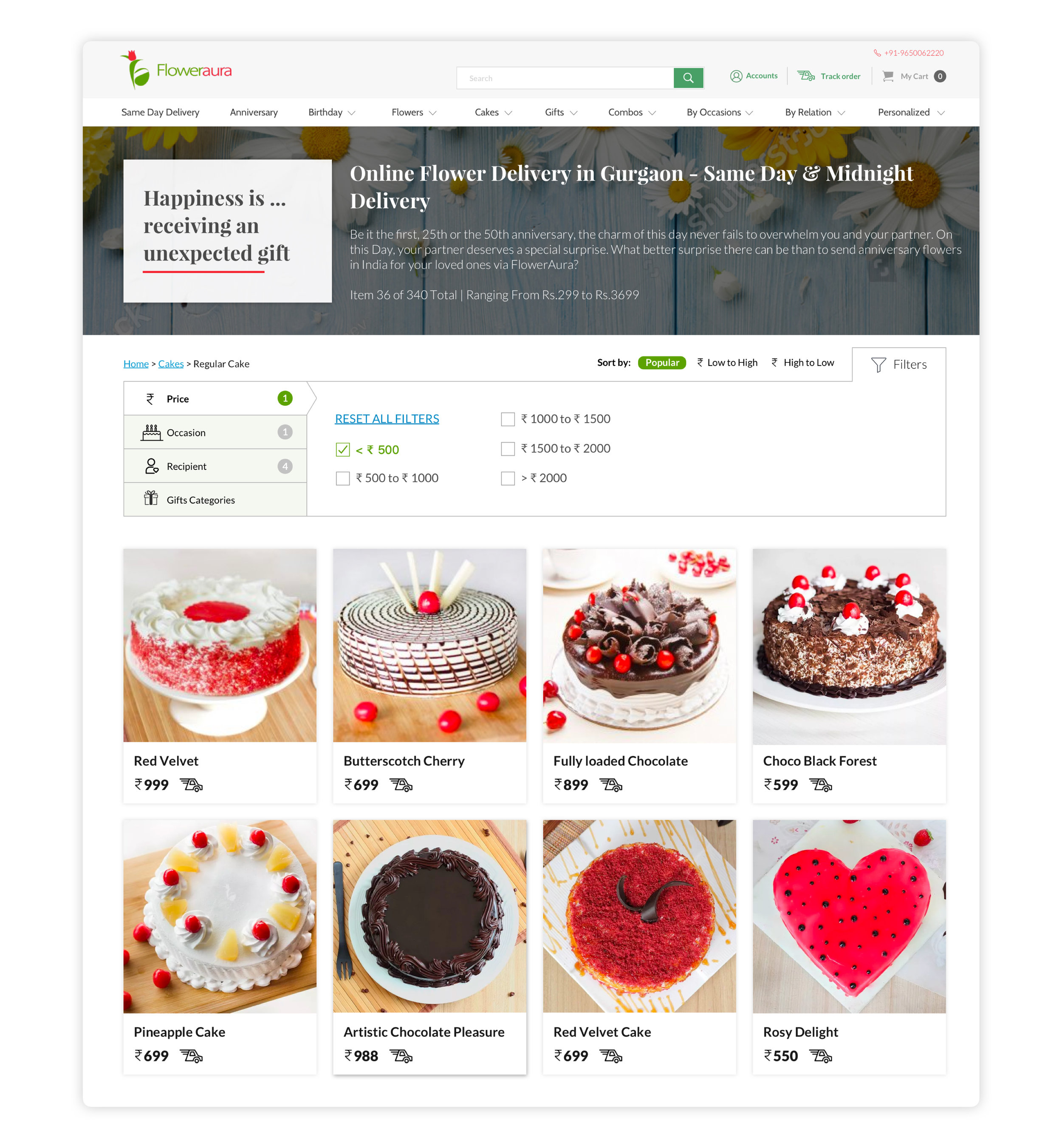
While talking to users and doing surveys, I learnt that most of them were stuck with a few options or flavors of cakes. But what they wanted instead was to explore more than one flavor before choosing. This is why our listing page gives the users various options of viewing the product – by Popularity, Flavors, Occasions etc.

Action is here
One of our aims was to make the information on the website as accessible as possible. This is why the big images permit the users to access all the required information without needing to click on it in order to zoom in.
Filter & Sorting
Now users can sort and filter listings by Best Price, Occasion, Category and more. Filters didn’t take much space on the page and users can see immediately the wanted response on the screen after they click on any action.
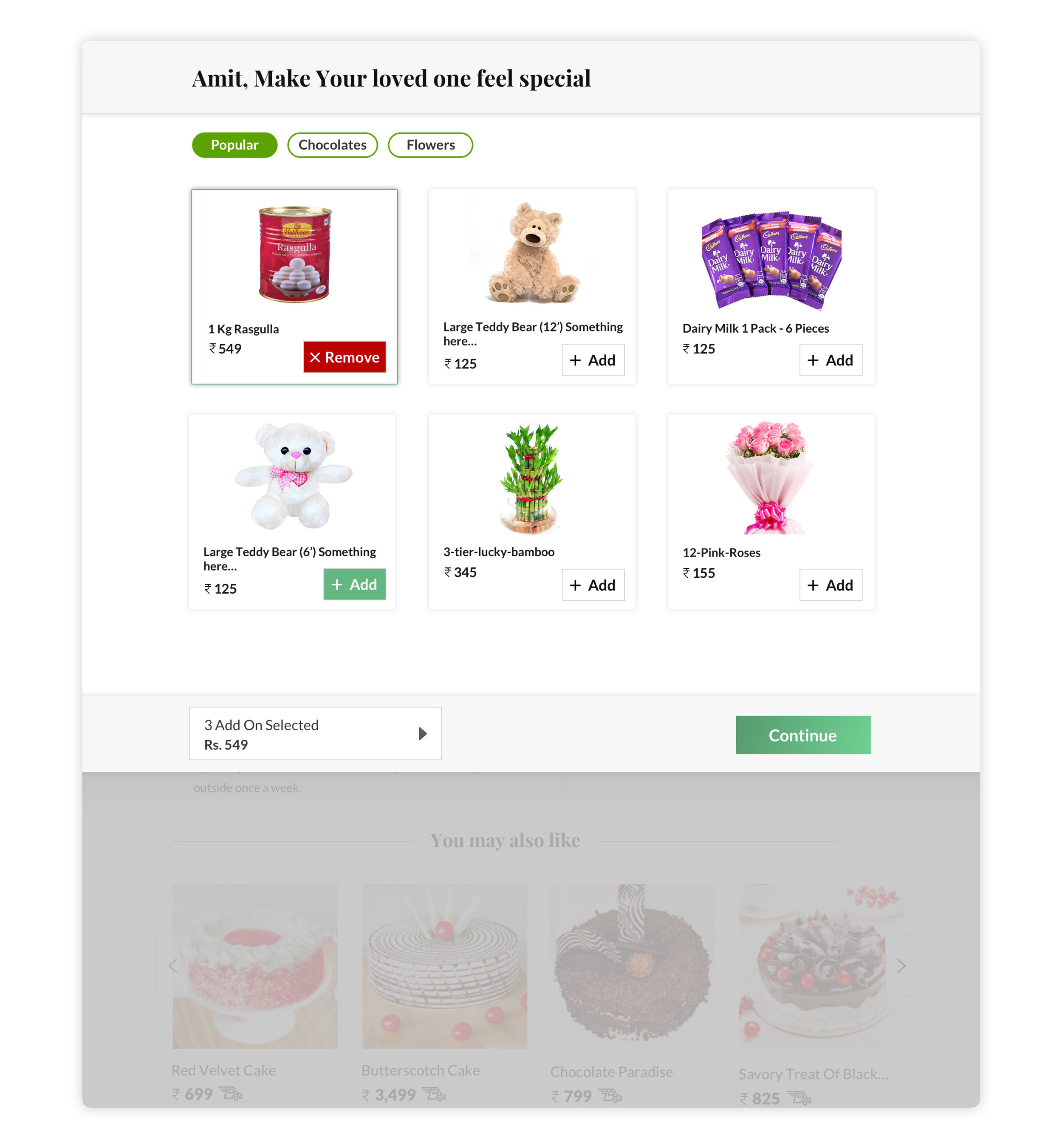
Add ons
Up Selling screens are generally intimidating and frustrating, but we made the screen of Floweraura visually clear.
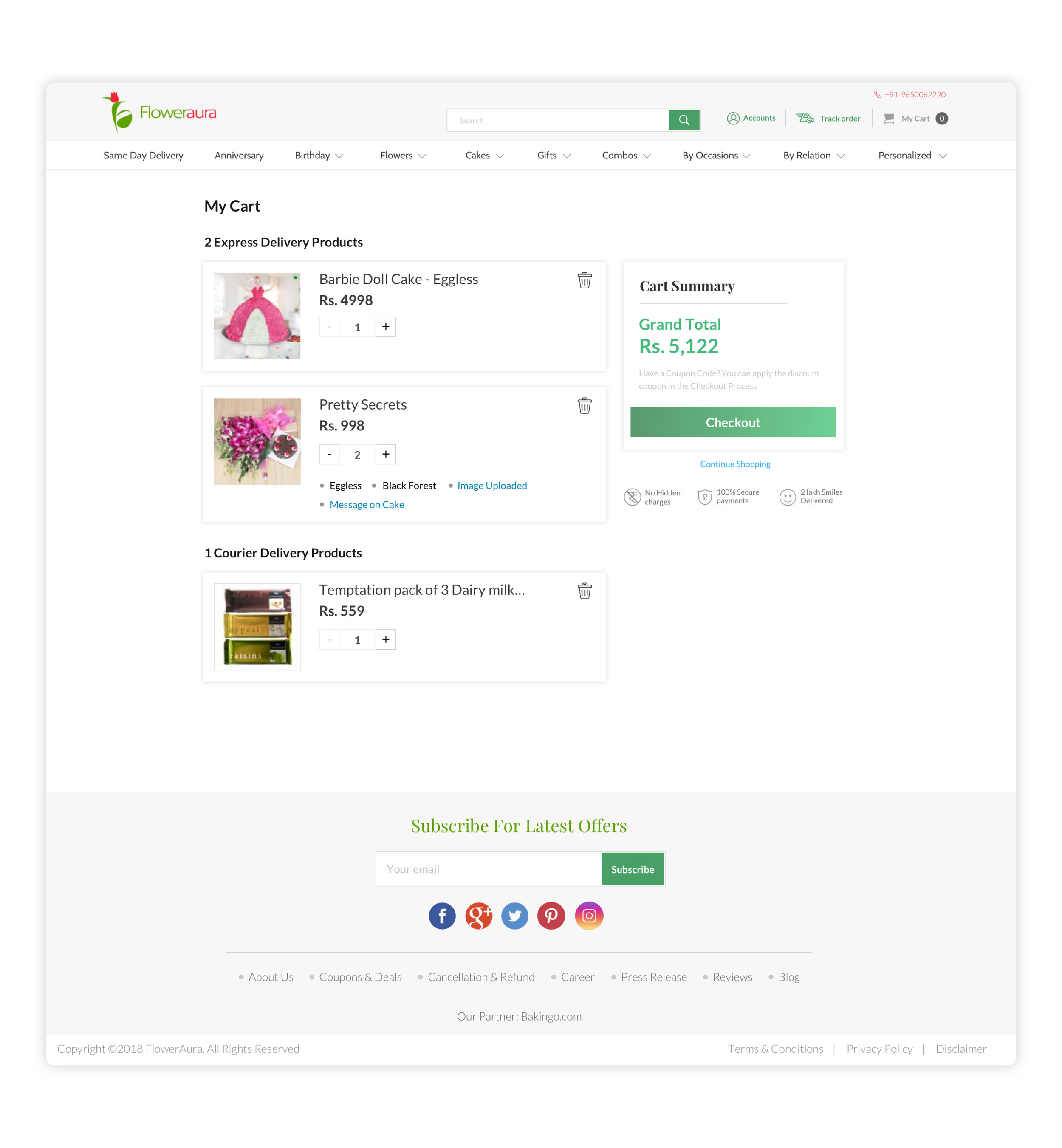
My Cart
Users have started spending less time on the website due to clutter free and easy to understand cart design. All the important actions like Checkout, Delete, Adding more products were now clearly visible to users.